|
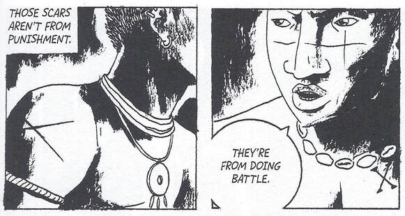
I was invited to contribute an essay for the summer 2020 cycle of the "Black One Shot" series for ASAP/Journal online. My post reflects on the different visual representations and shifting meanings of bodily scars in Marcelo D'Salete's incredible graphic novel, Angola Janga: Kingdom of Runaway Slaves. Check it out and all the other great posts in the series here: http://asapjournal.com/b-o-s-9-3-angola-janga-kingdom-of-runaway-slaves-qiana-whitted/
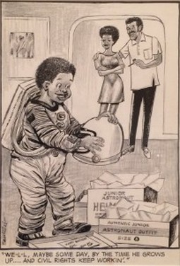
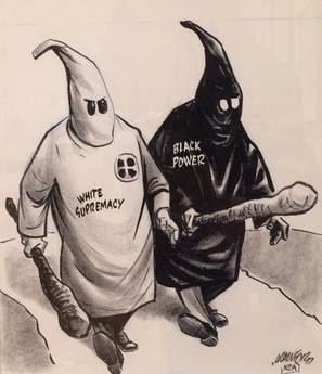
Originally posted at The Hooded Utilitarian. Public outrage over the killing of 18-year-old Mike Brown in Ferguson, Missouri continues to amass its own tragic iconography. Handprints transform the so-called universal sign of surrender into a stronghold of dissent: “Hands up, Don’t shoot.” Hashtag memorials shape the interconnectivity of social media into a pictorial chorus of text: #BlackLivesMatter #JusticeforMikeBrown #ShutItDown. I think about my own son at two years old and already curling his brown fingers into Spider-Man web shooters, and vainly I hope that the right counter-visual will fix what’s wrong, or at least begin to impair what Matthew Pratt Guterl, refers to as “the familiar grammar of racial sight, through which a wallet becomes a gun or a Harvard professor becomes a burglar.” I also had the chance to consider how the call for racial justice registers through image when I toured the exhibit on “The Long March: Civil Rights in Cartoons and Comics” at OSU’s Billy Ireland Cartoon Library & Museum last month. Among the stately commemoration of landmark firsts – including incredible pages of original art from Pogo, Wee Pals, and Green Lantern/Green Arrow – the corner of the room displaying the editorial cartoons seemed louder and more demanding in their effort to picture the raucous discord of the moment. We can learn a great deal from the way Pittsburgh Courier cartoonist Sam Milai uses the Junior Astronaut Helmet as a visual metonym for the aspirations of a middle-class African American family (below), only months after Neil Armstrong walked on the moon: In another image, Bill Crawford speaks to fears over militant Black Nationalism in a cartoon that invokes the Ku Klu Klan to set the boundaries of acceptable (and respectable) protest in 1968:
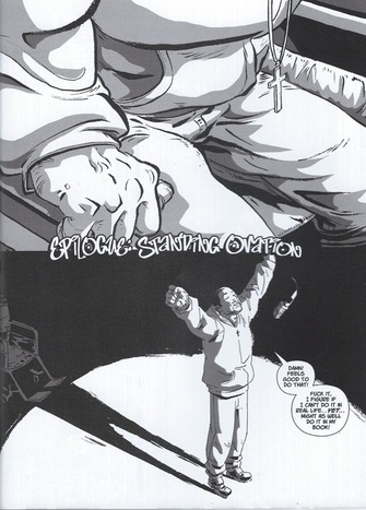
Originally posted as part of the Groensteen and Page Layout Roundtable at Hooded Utilitarian. 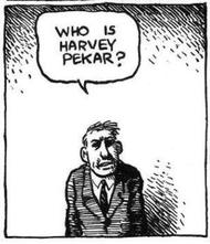 The previous contributions to our roundtable have raised important questions about Thierry Groensteen’s approach to page layout in Comics and Narration. While a rich array of images in Adrielle Mitchell’s post encouraged us to consider how frame irregularities produce meaning, Roy Cook set the stage for an important conversation about the values comics readers attribute to different panel arrangements. Roy’s post really got me thinking about the way Groensteen privileges the layout pattern of the “waffle-iron” by identifying stability, simplicity, and transparency as fundamental attributes of the orthogonal shapes. Groensteen further conceptualizes the grid in the narrative rhythm of comics as the “basic beat” against which the visual and verbal elements of comics can improvise. From this perspective, it’s not difficult to see how one might characterize the grid as “regular” or “neutral” or “invisible,” but I remain troubled by the relative nature of these terms, who defines them and in what context. To complicate the issue, my first instinct was to seek out comics that delight in the wildly experimental layouts that Groensteen might find “more sophisticated (or more hysterical),” but Adrielle’s post provides several excellent examples already. So I thought I would ask instead about comics that use the grid, but in unexpected ways: how do comics adapt the basic panel layout in order to stray from what Roy described as Groensteen’s “waffle-iron way of truth”? When is a grid not just a grid? I wonder, for example, how a comic like “The Harvey Pekar Name Story” fits into our understanding of frame regularity and rhythm. Though we may be inclined to make assumptions about its uniformity at first glance, R. Crumb has not simply drawn 48 identical copies of the same man in the squares of this four-page comic about the different Harvey Pekars listed in the phonebook. Originally posted at The Hooded Utilitarian. How do critiques of identification complicate Western models of empathy? What might empathy look like, and produce, when it doesn’t require identification? What about more difficult cases in which the reader is required to empathize with the oppressor, or with more complicated protagonists? – Megan Boler, “The Risks of Empathy” 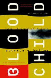 I didn’t agree to participate in this roundtable on Octavia Butler because I enjoy her writing, but rather because I don’t. My admiration for her storytelling is nothing short of begrudging; I have to work at it. And I’ve always been careful to attribute my resistance to matters of personal taste. Butler is, after all, a beloved award-winning writer in science fiction, a pioneer who helped open a space for communities of black speculative fiction writers that I adore, including Nnedi Okorafor, N.K. Jemison, Tannarive Due, and Zetta Elliot. So if I find the slug-like aliens in Dawn nauseating or if the pedophilic undertones in Fledgling nearly keep me from finishing the novel, then I assume that’s my problem. My displeasure doesn’t prevent me from recognizing Butler’s importance in my African American literature courses and I teach her fiction whenever I can, with her 1979 novel Kindred being the most popular. Students are eager to embrace the story’s invitation to see the interconnected perils of slave resistance and survival through Dana’s modern eyes, grateful that the narrative’s historical corrective comes at the comfortable distance of science fiction tropes. The book raises provocative questions for debate, although I admit to being troubled by how often readers come away from Kindred convinced that they now know what it was like to be enslaved. Too often, their experience with the text is cushioned by what Megan Boler characterizes as “passive empathy”: “an untroubled identification that [does] not create estrangement or unfamiliarity. Rather, passive empathy [allows] them familiarity, ‘insight’ and ‘clear imagination’ of historical occurrences – and finally, a cathartic, innocent, and I would argue voyeuristic sense of closure (266). Much of Butler’s fiction doesn’t work this way, however. Estrangement and unfamiliarity, particularly in relation to ugliness and the repulsiveness of the alien body, are central to her work. And this is what gets me. The non-human creatures she imagines make me cringe and their relationships with humans in her fiction are even harder to stomach. My first reaction to the Tlic race in Butler’s 1984 short story, “Bloodchild,” was disgust, made all the more unnerving because of the great care Butler seemed to take in the description of the strange species; the serpentine movements of their long, segmented bodies resemble giant worms with rows of limbs and insect-like stingers. Originally posted at The Hooded Utilitarian. In the comics memoir, Sentences: The Life of M.F. Grimm, Percy Carey tells of his experiences growing up in New York, finding success as an emcee in the early 90s, and getting caught up in the drug trade and gang shootings that would eventually leave him paralyzed from the waist down. Artist Ron Wimberly sketches Carey on the graphic novel’s cover in a wheelchair as he is now, rather than surrounded by fans or performing on the stage he once shared with names like Snoop Dogg and Tupac. The choice is fitting, given Carey’s interest in conveying the social and economic realities of his life behind these scenes and after spending time in prison. But in the epilogue subtitled “Standing Ovation,” Carey grasps the wheelchair’s arms and pushes himself up. A microphone dangles in the air above him. With his arms stretched out, chin raised, he steps forward and says: “Damn! Feels good to do that! Fuck it, I figure if I can’t do it in real life…yet…might as well do it in my book!” When we are asked to consider what makes comics unique, I think that our conversation should include scenes like this one. We know that the distinguishing features of comics can extend beyond formal elements to include stylistic practices that develop and advance whenever a sequence of words and pictures tell a story. In this case, Sentences provides an opportunity to talk about what happens when genre conventions refuse to stay put in graphic narratives that are based on actual events.
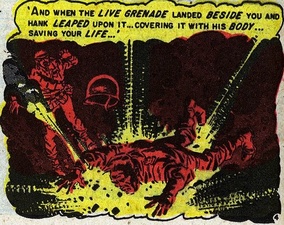 Originally posted at Pencil Panel Page. I am looking for more effective ways to talk about color and the strategies that colorists use to convey meaning in comics. I’d be grateful, too, for examples of comics that you feel are particularly striking or innovate in their use of color. In my comics course this semester, I have found myself alluding more frequently to McCloud’s brief chapter on color in Understanding Comics, but I’d like to build upon these terms and concepts to analyze coloring more convincingly as a signifying tool. The class’s most recent discussion of Jeremy Love’sBayou referred often to how the southern landscapes of the comic were made all the more lush, haunting, and gruesome by Patrick Morgan’s distinctive use of color, a vivid palette that recalls children’s picture books and Disney cartoon animation. Color frames readerly expectations about the content in this example, but the interplay between text and image ultimately enlists these very color choices to critique the aesthetic expression of the southern past as idyllic nostalgia. Color is particularly useful in exploring how socially constructed ideas about race negotiate the realities of skin color (something I also discuss here in this post’s thought experiment). Another example that I find interesting comes from the 1953 story “In Gratitude” by Al Feldstein and Wally Wood from Shock SuspenStories. In this scene, the parents of a Korean War veteran named Joey visually recount the incidents narrated in their son’s letters from the frontline. Described in the letters are the heroic deeds of a fellow soldier named Hank who ends up giving his life to save Joey. Originally posted at Pencil Panel Page.
I don’t give much thought to page numbers when I’m reading comics simply for pleasure, but in my research and teaching, their absence can be exasperating. I can’t remember how many times I counted the 300+ pages in volumes 1 and 2 of Jeremy Love’s Bayou for an essay that I published on the series, and in the end, I don’t know how helpful my citations are for those who don’t take the time to count out each page on their own. And any instructor who has ever taught Jimmy Corrigan: The Smartest Kid on Earth knows what a bizarre experience it is to refer to Chris Ware’s pages in purely descriptive terms or in proximity to the narrative’s tiny paper cut-outs while the students flip madly through the book to catch up. The origin of this practice may be related to the history behind comics editing and printing procedures, particularly given the insertion of ads and other extra-textual material in the traditional comic book pamphlet format. In his cultural history of the medium, Comic Book Nation, Bradford Wright didn’t even bother to include page numbers in his citations, claiming that “pagination in comic books is inconsistent and generally irrelevant” (xix). |
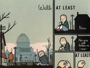
AboutAn archive of my online writing on comics, literature, and culture. (Illustration above by Seth!) Categories
All
Archives
July 2020
|
 RSS Feed