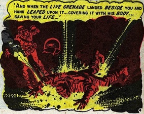
 Originally posted at Pencil Panel Page. I am looking for more effective ways to talk about color and the strategies that colorists use to convey meaning in comics. I’d be grateful, too, for examples of comics that you feel are particularly striking or innovate in their use of color. In my comics course this semester, I have found myself alluding more frequently to McCloud’s brief chapter on color in Understanding Comics, but I’d like to build upon these terms and concepts to analyze coloring more convincingly as a signifying tool. The class’s most recent discussion of Jeremy Love’sBayou referred often to how the southern landscapes of the comic were made all the more lush, haunting, and gruesome by Patrick Morgan’s distinctive use of color, a vivid palette that recalls children’s picture books and Disney cartoon animation. Color frames readerly expectations about the content in this example, but the interplay between text and image ultimately enlists these very color choices to critique the aesthetic expression of the southern past as idyllic nostalgia. Color is particularly useful in exploring how socially constructed ideas about race negotiate the realities of skin color (something I also discuss here in this post’s thought experiment). Another example that I find interesting comes from the 1953 story “In Gratitude” by Al Feldstein and Wally Wood from Shock SuspenStories. In this scene, the parents of a Korean War veteran named Joey visually recount the incidents narrated in their son’s letters from the frontline. Described in the letters are the heroic deeds of a fellow soldier named Hank who ends up giving his life to save Joey. 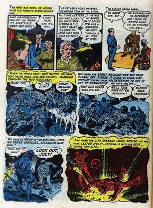 What Joey’s mother and father don’t know initially, however, is that Hank is African American. The comic invites us to see through their field of vision as they read the black soldier’s virtues in Joey’s “raceless” prose as white. Yet the way the panels are colored, the men on the battlefield are washed in hues of blue and later a field of deep red as Hank leaps on the grenade. The colorist’s choices convey the clash between Joey’s recollections and his parent’s assumptions, and the monochromatic panels might even been said to have a democratizing effect on the bodies being battered and broken under fire. (Perhaps it is no mistake the expressionistic color choices are also the primary color of the American flag.)
“In Gratitude” ends with Joey ashamed and outraged at his parents and his hometown for refusing to bury Hank alongside their cemetery’s white bodies. The work of EC’s colorist — most likely Marie Severin — help to reinforce the comic’s critique of these segregation practices as well. How does color factor into your evaluation of comics? What resources and examples do you use to talk about this element of the form’s style? Comments are closed.
|
AboutAn archive of my online writing on comics, literature, and culture. (Illustration above by Seth!) Categories
All
Archives
July 2020
|
 RSS Feed